Episode #317
My Favorite Graphs: Stronger Together from The New York Times
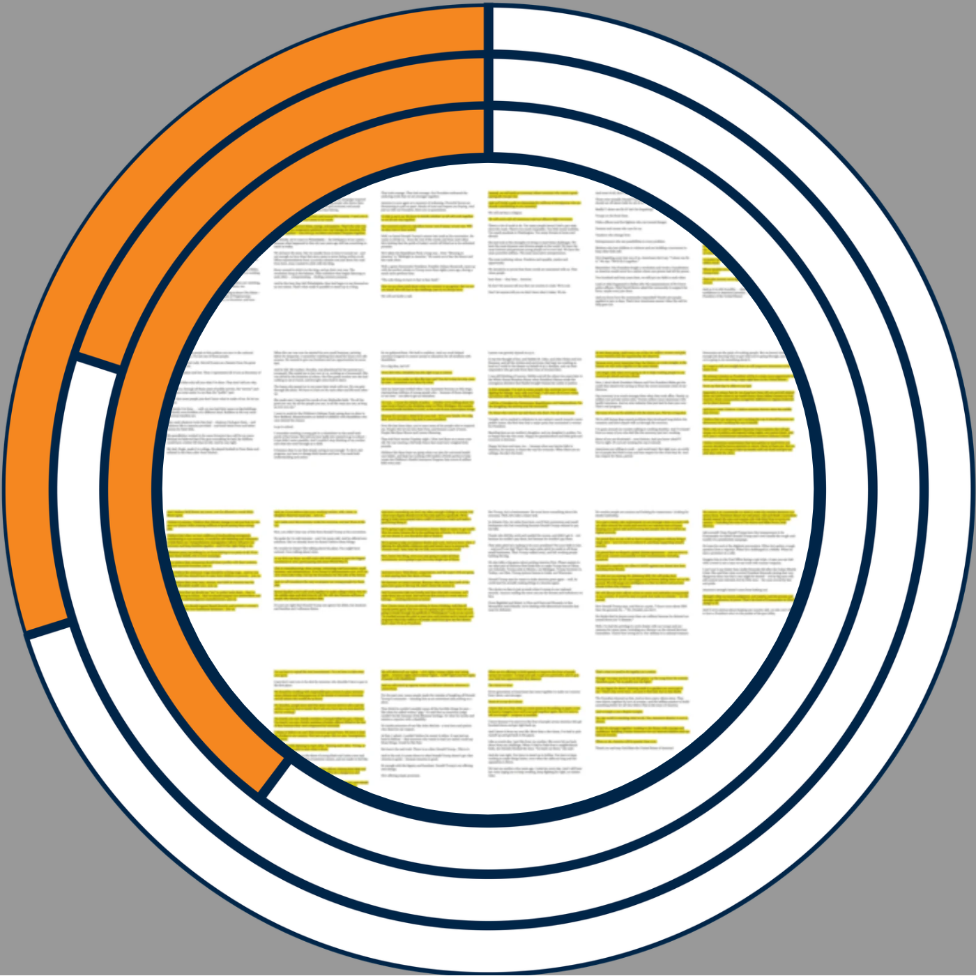
In this My Favorite Graphs episode, I revisit a 2016 New York Times visualization comparing the convention speeches of Donald Trump and Hillary Clinton. I explain why highlighting phrases across miniature pages can reveal themes in qualitative data that word counts and bar charts can miss. I share how I have used a simple version of this technique in my own work and discuss tools for creating similar views. Alicia contributes a voice note about the project's development, including the highlighted Google Docs behind the finished graphics. I also discuss how pairing an overview with example quotes can help readers see the broader context of an interview, focus group, or speech. Subscribe to this podcast. Follow this show and everything dataviz on Instagram , LinkedIn , Substack , X , and YouTube . Check out the PolicyViz website to learn more about data and data visualization. Questions? Comments? Pitch ideas? Email me at: jon@policyviz.com Hosted by Zencastr where you can record, transcribe, edit, and automatically publish your meetings, podcasts, and more.